いいね 16
彩り舞う青春ポートレート 右上ロリ
カラフルな紙吹雪が舞う世界で、黒髪の少年と赤茶髪の少女が次々と衣装を着替える。学校の日々からお出かけ、特別な瞬間まで。ふたりの成長と冒険を彩る、服選びの物語が今、始まろうとしている。◯ 「今日もおしゃれを楽しもう!」と笑顔でポーズを決める少女。カラフルな背景に映える様々な服装と表情が、彼女たちの明るい性格を物語っている。
Using the reference images as the basis for the character design, create ‘professional-grade character line art reference materials of the kind used in commercial animation production’.
Ensure that the character’s face, hairstyle, hair colour, eyes, contours, body shape, silhouette, costume design, head-to-body ratio and overall impression are accurately maintained.
Do not compromise the character’s identity under any circumstances.
Do not redraw the character as a different character.
This is not a finished illustration.
This is not concept art.
This is not a poster.
The purpose is to create
reference materials for sharing artwork
with animators, animation directors and key animators.
The layout should be
a reference sheet with a white background.
Arrange multiple line art drawings
in an organised manner as reference pages.
Include the following:
r:1>,
Front view
Angled view
Profile
Variations in facial expressions
Close-up of the eyes
Hair flow check
Full-body front view
Full-body back view
Arm and hand shape check
Costume details
Shoe design
Accessory structure
Characters should be
depicted using only clean anime line art.
Do not colour.
Do not use solid fills.
Do not use thick shading.
Do not render.
Lines should be
thin and neat pencil lines or clean-up lines,
similar to those used in Japanese TV anime production.
Do not make them too rough.
Do not use manga-style lines.
Do not make them look too much like a sketch.
As reference material for production,
prioritise readability and structural clarity above all else.
Within the pages,
naturally add small handwritten notes,
arrows,
part instructions,
simple annotations,
costume structure notes,
hair flow instructions, etc.
The layout should have
the feel of Japanese anime artbooks from the 1990s to the 2000s.
Although the information density is high,
it is organised in a way that is easy to read.
Include natural margins on the page.
The overall layout should have
the feel of a scanned, physical art book.
Naturally incorporate subtle paper texture,
a slight sense of printing,
the look of photocopied paper,
and a scanned appearance.
The top priority is that it looks like
‘actual production materials’,
rather than a finished work of art. , <lora:hairdetaile noline:1>
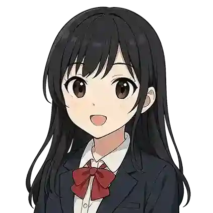
キャラクターたちの表情や服装に一貫性があって、68点としっかりした印象を受けました。かわいらしい雰囲気も感じられて62点の可愛らしさは伝わってきます。一方で、全体の配置や独創性はもう少し工夫すると良く